Brand Development and Packaging for Baked by Sticky
Taking a bakery nationwide by creating a brand with personality
Background
Sticky Fingers Sweets & Eats was founded in 1999, as one of the first all-vegan bakeries in the United States. Their mission: No one should skip dessert. Whether you have an allergy to eggs or a disdain for dairy, our plant-based mission is simple: create indulgent desserts that are better for you, better for the animals, and better for the environment.
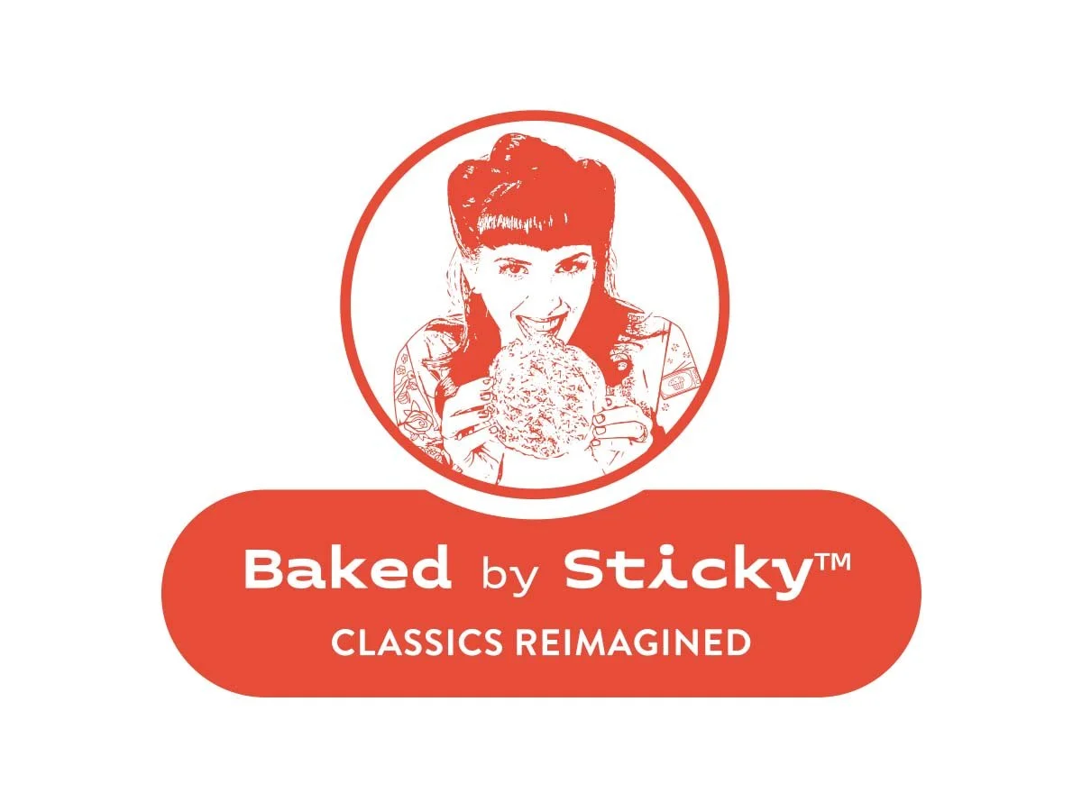
Doron Petersan aka “Sticky” is the charismatic owner and operator who wanted to make the leap into CPG brands and bring her plant-based recipes nationwide. What she never intended was to use herself as the face of the brand. However to us it was obvious, this new brand spin off needed her at the center. The industry already knew her as “Sticky” and her existing customers loved her award-winning sweets. We knew we needed this new brand to evoke a sense of nostaligia (classic sweets) with a bit of almost naughty fun… an indulgence but not one to feel guilty about since they are made with plant based ingredients afterall. It took some convincing but we kept pushing to put Sticky front and center of the packaging, coupled with a bio on every package we titled “Who the heck is Sticky”. We partnered with Doron to develop the new brand and packaging for her ever-growing line of classic products reimagined for today’s tastes. From this relationship, came – Baked by Sticky.
Baked by Sticky, now a division of Sticky Fingers Sweets & Eats, brings the bakery experience to grocery store shelves and right to customer doors – with Baking Mixes, Cookies, Brownies and specialty treats that are plant-based, allergy friendly, kosher and made without banned ingredients.
Project Objective
The goal was to develop a compelling brand identity and packaging system that would reflect the bakery's artisanal roots and the “classics reimagined” message, while appealing to a wider audience, ultimately driving sales through their website and retail distributors.
Brand Development Process
Discovery & Research: Conducted in-depth interviews with stakeholders to uncover the brand’s core values and unique selling points.
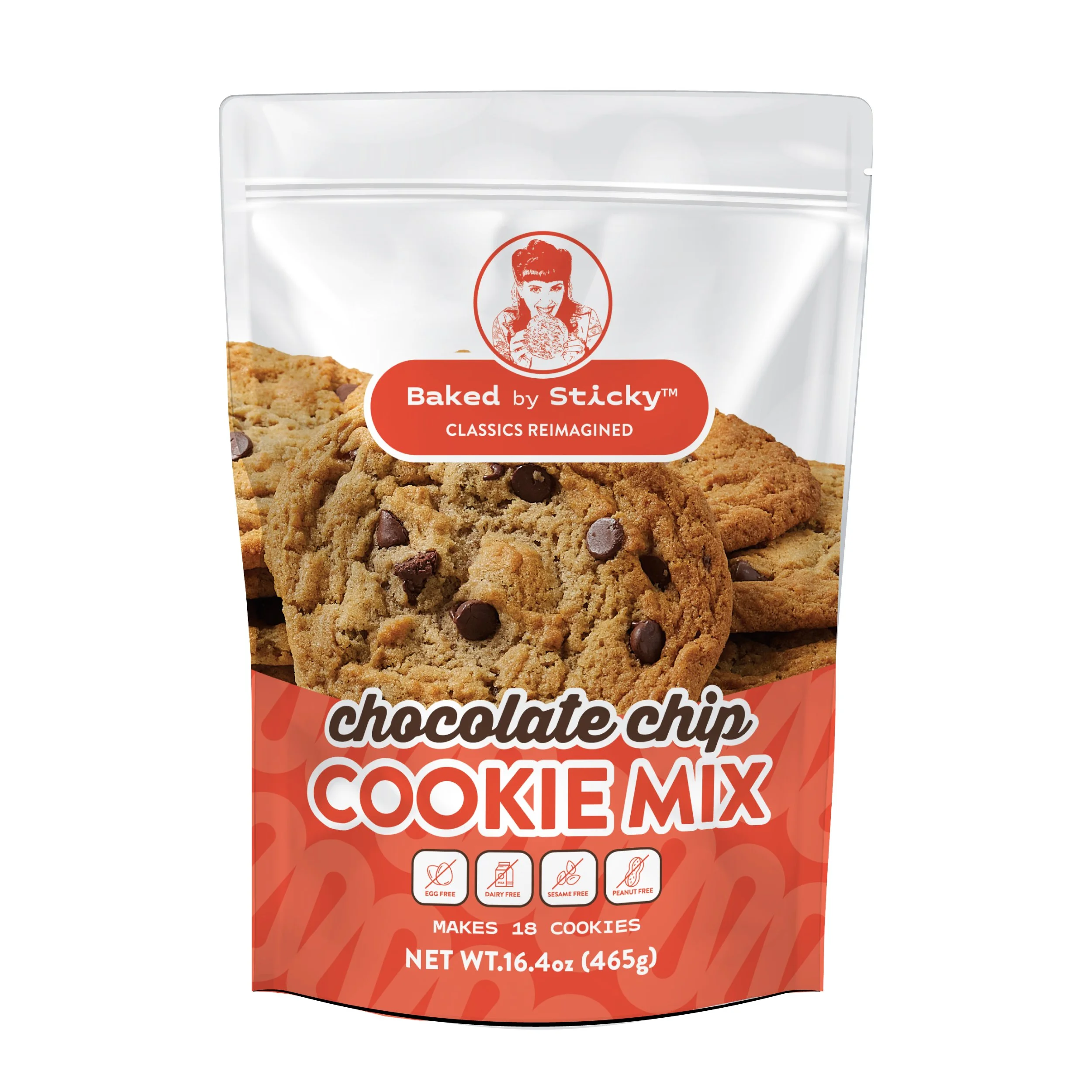
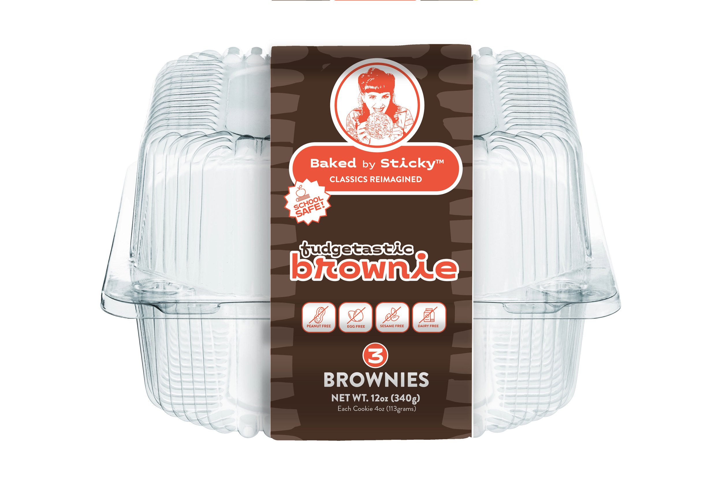
Visual Identity Design: Developed a warm, slightly naughty new logo with a focus on “Sticky” herself, based on a portrait of her. We began with a color palette that pulled from their sticky Fingers Bakery brick and mortar brand. The goal is to evoke the nostalgic, homemade, better-for-you yet still indulgent nature of Baked by Sticky’s offerings.
In addition to her regular line of mixes, singles and multi-packs, Baked by Sticky also brought their own line of High-protien goodies to market. And this line required its own spin and color palette to compete in the Protein packed arena of retail baked goods which we created to stand out on shelves.
Messaging: Crafted brand messaging to highlight the bakery’s commitment to quality, allergy friendly, plant-based ingredients and inventive recipes.
Packaging Transformation
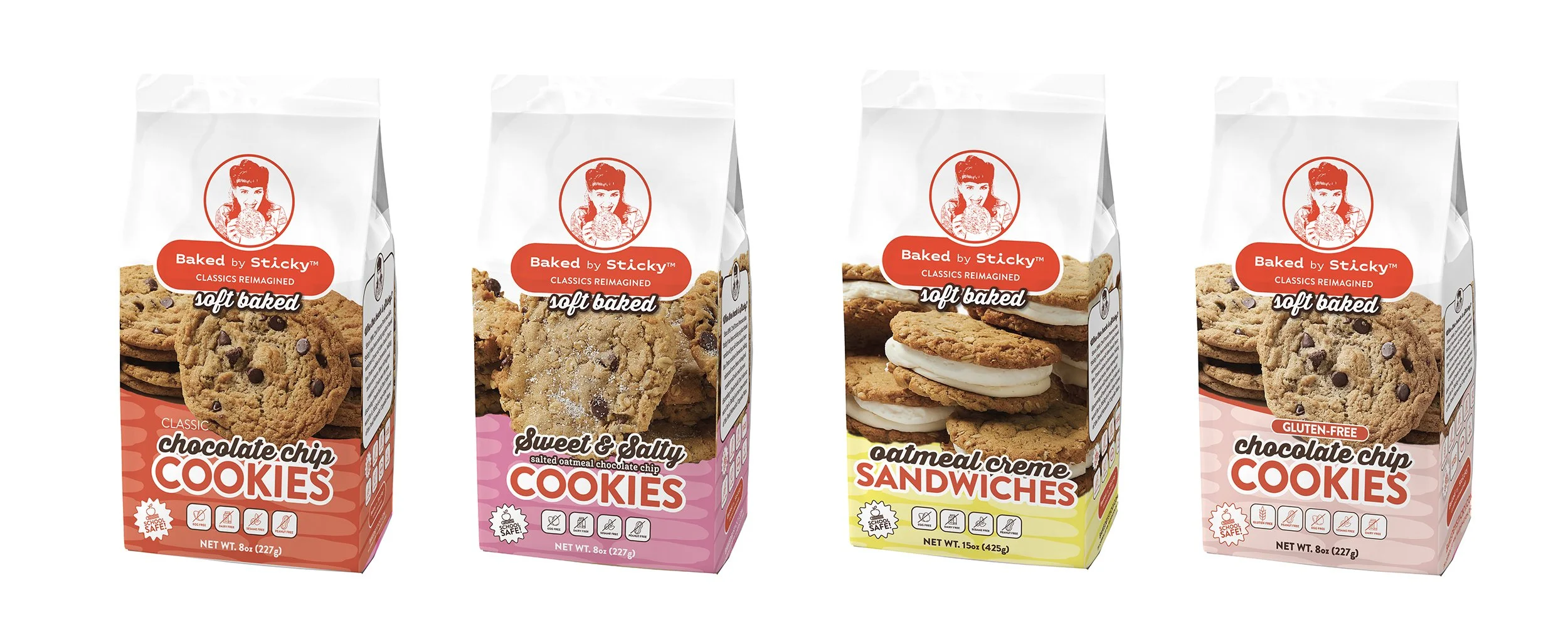
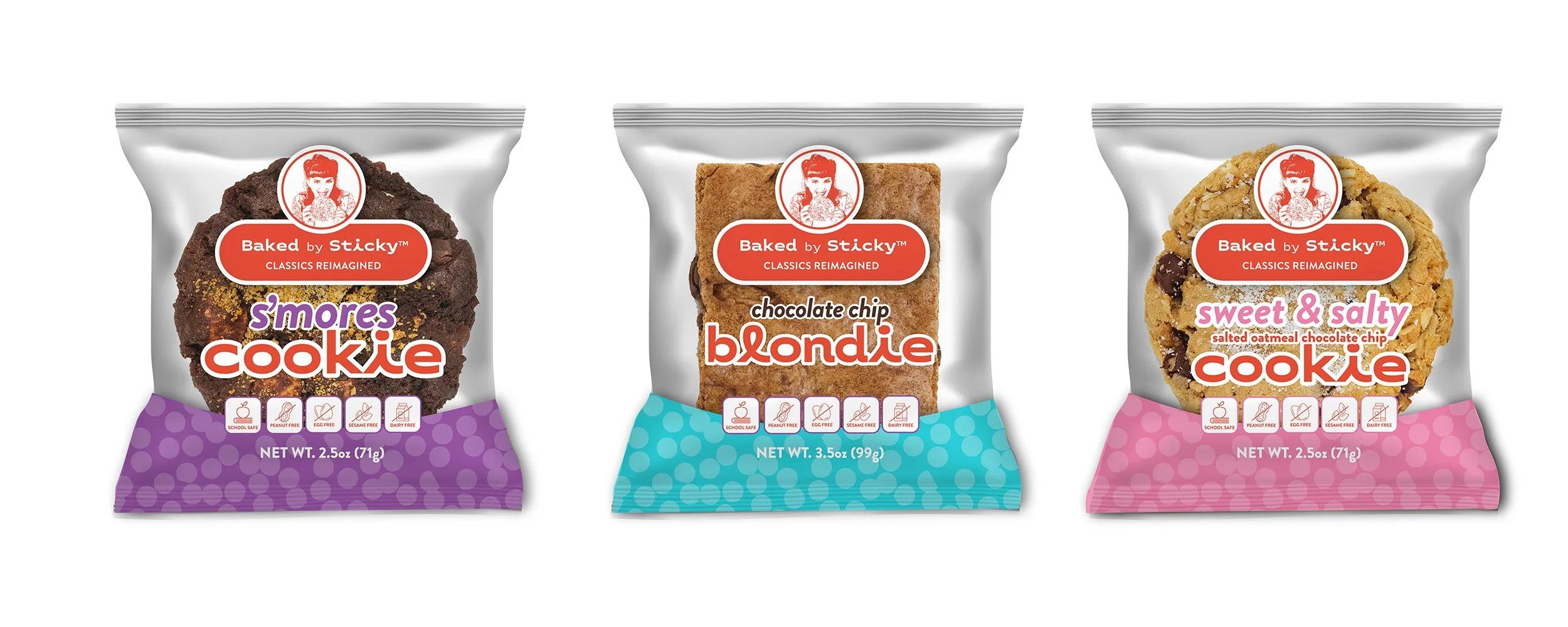
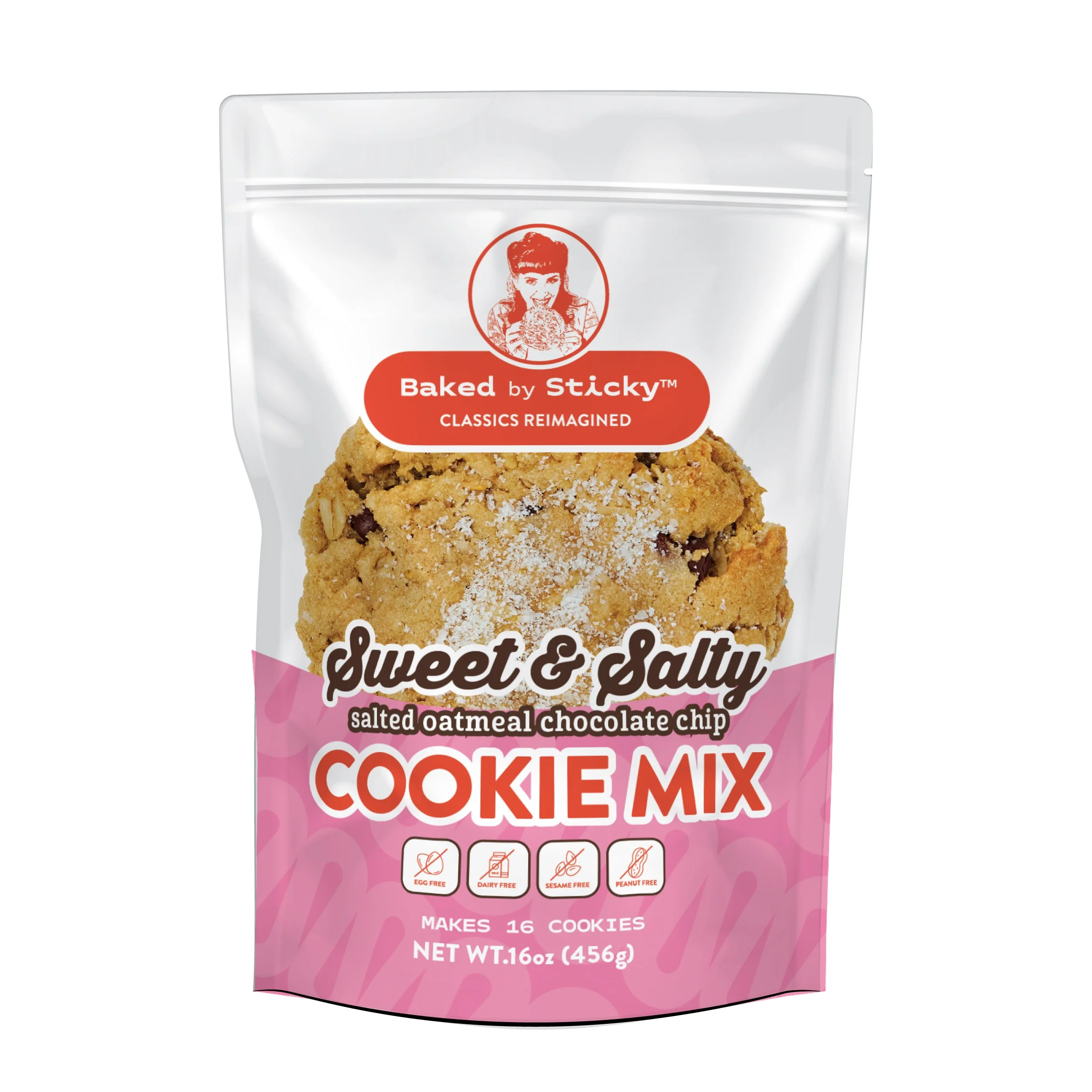
Concept Development: Designed packaging solutions that are both visually appealing and functional, choosing materials, colors and layout for each product type across the range.
Packaging with Brand Consistency: Applied the new visual identity across boxes, Mix pouches, Films for single serve goodies and labels, ensuring a cohesive look whether products are sold in-store or through third-party retailers.
Results
The brand and pacakging have been met with a lot of enthusiasm and continues to grow and evolve, with interest and contracts with large nationwide retailers. As new retailers are gaining interest and new products are presented to retailers, we continue to work with the client to hone and adjust as their needs change.
Conclusion
This project is proof that strategic brand development and thoughtful packaging design can elevate a bakery from a local favorite to a retail standout.


